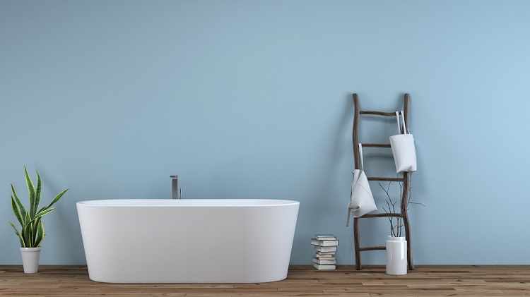
Choosing a Bathtub for Two: Sizes, Features, Installation & Other Considerations Before You Purchase
There’s a gap between what a freestanding bathtub listing tells you and what it actually feels like to share one.
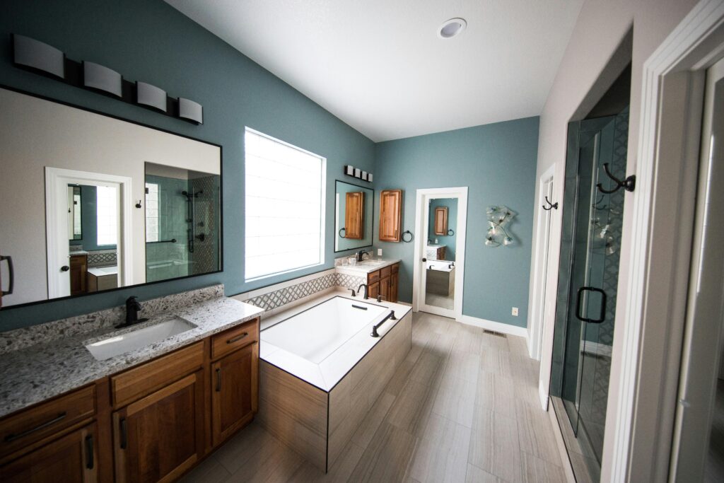
Changing the color of your bathroom can breathe life to an old bathroom without the fuss of a remodel, as well as deeply improve your mood. In these uncertain times, small projects such as changing your bathroom colors can provide the perfect distraction and is the perfect DIY project to undertake yourself. Today we will discuss some popular bathroom color ideas for 2025 and see if any are right for your home. In addition to a fresh coat of paint, considering the best bathroom lighting ideas can significantly enhance the overall ambiance of your space. Lighting can highlight your new colors and create a serene atmosphere, making your bathroom a personal retreat. Whether you opt for soft sconces or sleek overhead fixtures, the right lighting can transform your bathroom into a stylish sanctuary. From bold shades to soft pastels, there are countless options to consider that can transform your space into a personal oasis. Whether you’re leaning towards vibrant hues or serene neutrals, there’s a palette to suit every style. Additionally, as you explore color options, consider how they can complement popular bathroom styles. Whether you lean towards serene pastels or bold, vibrant hues, the right colors can enhance both the aesthetic and functionality of your space. Embracing the latest trends can help create a bathroom that feels fresh and inviting. Whether you opt for soothing pastels or bold, vibrant hues, choosing the right palette can set the tone for relaxation and rejuvenation. Some of the most popular small bathroom colors for 2025 include soft greens, muted blues, and warm neutrals, which can help create a serene atmosphere even in the tiniest spaces. By experimenting with different shades, you can transform your bathroom into a personal oasis that reflects your style and elevates your spirits. Consider incorporating soft pastels or bold jewel tones to create a unique ambiance that reflects your personal taste. Additionally, when updating your bathroom, don’t overlook the popular toilet colors, which can complement your chosen palette and add a cohesive look to the space. With the right hues, your bathroom can transform into a serene retreat where you can unwind and rejuvenate.
The catalog of colors discussed below is polled from a variety of various sources such as Home Depot, Good Housekeeping magazine, Wayfair.com, Benjamin Moore Paints, Behr Paints, and other homekeeping sites. These are the most common and asked-for colors for 2025, reflecting the current trend of the season. In 2025, the most prominent and asked-for colors are usually focused on summer, so these colors will generally be brighter and uplifting.
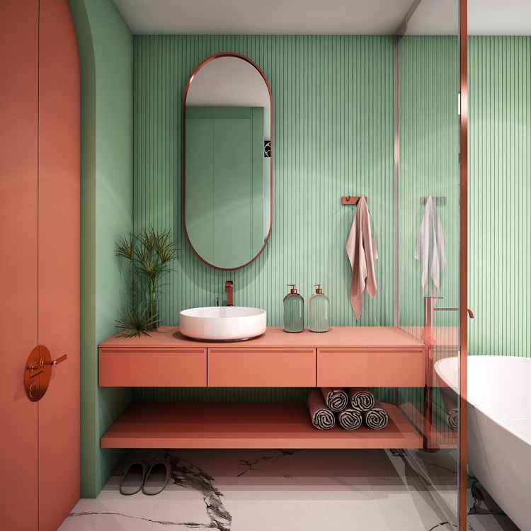
Sultan sand is a muted mix of orange and copper. It provides a good contrast with those looking for a tropical or Mediterranean appeal. It pairs well with similar colors of more muted and soft browns and yellows. This color is appropriate for both accessories such as towels as well as walls.
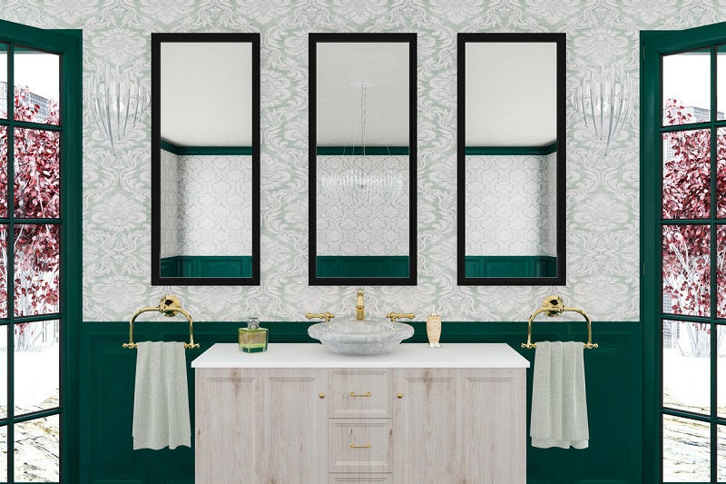
Night Watch provides a dark jade aqua-green color. This color pairs well with anything that is out in nature as it contains a very deep and rich color that is akin to nature. Night Watch is best used on walls and doors to provide a more attractive appeal.
Soft Taupe as it’s name implies, is a softer version of Taupe, which is a dark brown that sits comfortably between brown and gray. Taupe is a very un-intrusive color, perfect for a bathroom or a bedroom as it is subtle enough to allow other elements such as your bathtub, shower or vanity to shine better.
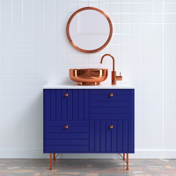
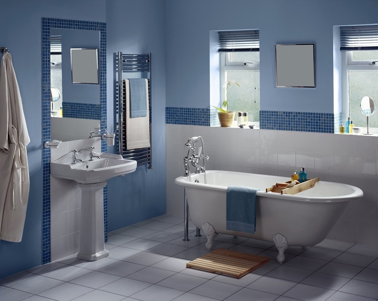
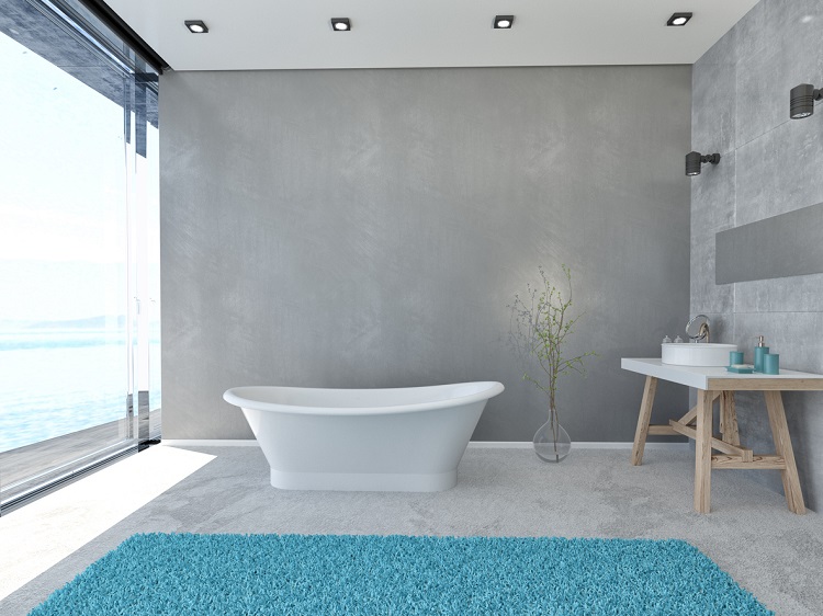
Navy blue, as its name suggests, is a more rich and deeper shade of blue. It provides a feeling of being close to the ocean and it pairs well with contrasts of red, orange, black or white. Since it’s color is so appealing, this is recommended for your bathroom walls as it lends very well with the standard bathroom amenities.
A deep brown with yellow undertones, dark mustard is great for a bathroom that has a similar composition, pairing well with other darker colors. Although yellow is a great deal harder to pair with other colors, with a little patience, it can be quite visually appealing, though you may want to layer it with other colors or designs, such as white or honeycomb designs.
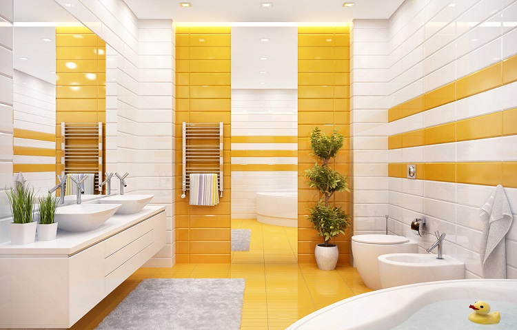
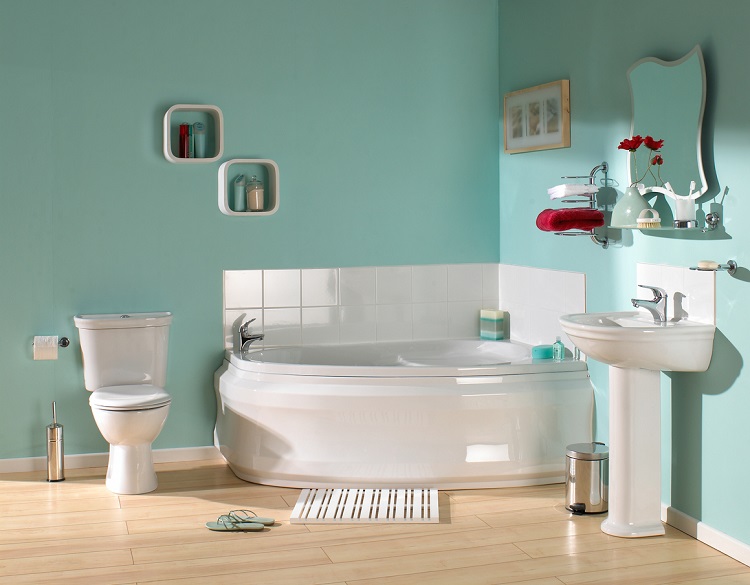
Powder blue is a classic color, matching well with other bright colors and giving off the appearance of the sky. Powder blue is a common fixture in nurseries and bathrooms, pairing well with whites and bright yellows, giving off an atmosphere of calm. Since the color is so vibrant, it can easily be applied to both walls and fixtures.
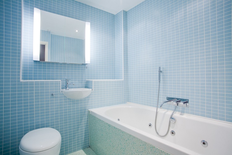
Similar to powder blue, dusty blue provides a slightly darker shade of blue. As before, dusty blue provides a feeling of weightlessness and is close to the sky in tone, making it a perfect summer color. It pairs well with whites, dark brown and darker colors, allowing it to be easily applied to both fixtures and walls.
Providing a color that is closer to lipstick in color, peach pink is a bright alternative to either peach or pink colors. This color can provide a good color contrast to coffee or dark brown alternatives and other darker colors. Since this color is so vibrant, it can provide a modern feel to any home and is best applied to walls.
Nano white is a warmer tone of white. Although it may not be not be immediately apparent, the warmer tone of it is quite a stark contrast to traditional white. Since the base of the color is white, this allows for an almost unlimited color contrast combination. The most ideal would most likely be darker colors such as brown and black, to really bring a classic color contrast. Nano white can be applied to both fixtures and walls and flooring.
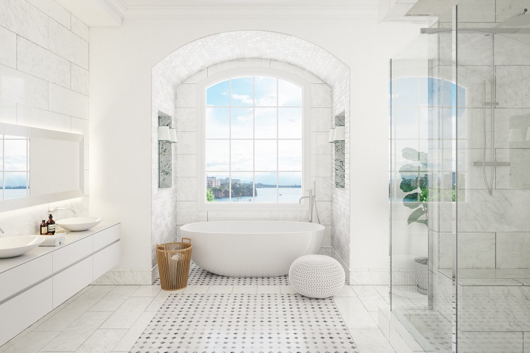
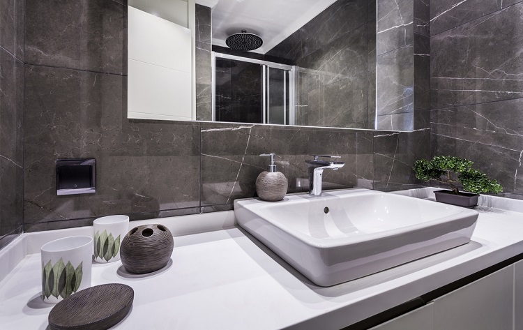
Ash Grey is a traditional color, made to reflect the ash left after a burning fire. It provides a darker hue than standard grey and is perfect for eliciting a more traditional feel in your bathroom. Ash Grey is perfect for bathtubs and wall surfaces and pairs well with lighter colors such as white or light blues.

Another classic color, seafoam green provides a nautical feel, that would compliment any light blues. Seaform green would be a good recommendation for bathroom walls, rugs and decor.
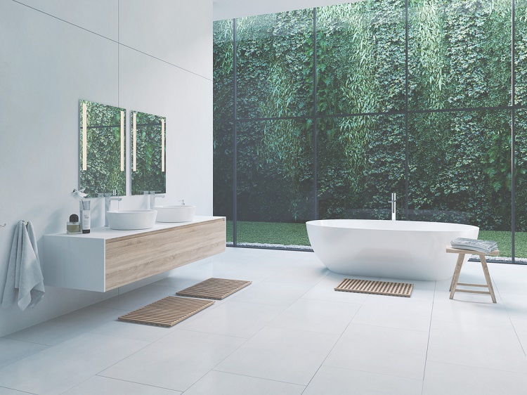
A shade of green that perfectly captures the hue of living plants, botanical green is meant to instill a sense of nature and life to your bathroom. It pairs well with darker colors such as coffee, black and dark browns. Conversely, it can also be paired with yellows and blues as well, to add more vibrancy. Botanical green is best applied to walls and furnishings.
A shade of blue that borders close to white, sky blue is meant to invoke the feeling of the sky and is perfect for any bathroom looking to add a sense of playfulness and calm. Light sky blue is perfect with whites, yellows and greys and is great on walls and furnishings.
Often mistaken for black, dark charcoal sits at a very dark shade of grey with bluish undertones. Though many of its uses are quite similar to black, contrasting well with bright colors such as white, brown and pairing well with dark and navy blues. Dark Charcoal is fairly flexible, allowing it to be applied to walls, fixtures and furnishings as black colors are generally very easy to pair with other colors.
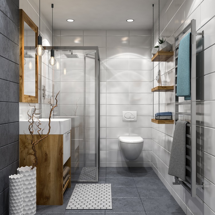
A darker form of soft Taupe, Taupe is dark brown that sits between brown and grey. Similar to it’s lighter counter-part, it is accented well against whites, light browns and more vibrant colors. Due to it’s unobtrusive nature, it is perfect for walls and flooring.
Another Benjamin moore classic, White Heron is a cool white with a slight blue undertone that is similar to finished marble. It is perfect for bright spaces that contrast well against blacks and greys. Since it’s white, it is a perfect color for walls, fixtures and furnishings. Rich vibrant colors accent well against white heron.

Another classic color, dating back to the 1900’s, cushing green is a lighter green paint that pairs well with just about any other colors, most noticeably, white yellows, coffee and black. It’s flexibility is a reason for it’s popularity, perfect for both walls as well as fixtures, if you so desire.
A mixture of cyan-blue and grey, Oxford grey provides the best of both worlds-the flexibility of shades with blue and the muted quality of grey. This allows oxford grey to be paired well with other colors as it hangs in the background. It is a classic color for this very reason, allowing other fixtures such as your tub and your sink to stand out more. Oxford Grey pairs well with whites, darker greys and black.
A shade of blue bordering on blue-green, buxton blue is a great addition to any home looking for a sense of vibrancy. It provides a classic feel, as it is one of the most used colors in home decor since 1910, giving your home a very classic feel. Buxton blue pairs well with yellow, black and white color contrasts and is more suitable for your walls than your fixtures.
Nothing screams classic appeal like thunder grey. Thunder grey provides a color scheme that is a mixture of grey with bluish undertones. It is a common staple in many 90’s suburban homes and the simple appeal of it’s colors is a reason for its popularity. Thunder Grey is a great color for fixtures, walls and furnishings, allowing it to contrast easily with a large array of other colors, though black, white and grey is a classic combination.
First Light is a mixture of white and pink. Unique to the Benjamin Moore paint line, it is meant to provide a vibrant alternative to white, allowing it to be paired in a similar fashion as traditional white, with darker colors to contrast. First light is most appropriate on the wall, although fixtures can also be painted with it as long as the correct contrast is applied.

Pistachio is a light green that provides a more bright vibrancy than standard green colors. It retains the best of both worlds-providing a color that is synonymous with nature while still being bright enough for summer colors. The brightness of the color pairs well with browns and more muted colors such as beige or grey and can easily be applied to walls or other amenities.
Greige is a mixture of beige and grey, providing a more vibrant grey than the standard grey color. While it won’t win any awards for vibrancy, greige is a very subtle color that pairs well with just about any other color you desire, making it an easy color to paint walls and vanities with, as it won’t intrude on other colors you have chosen for your home.
Cerulean is a lighter shade of blue, perfect for homes that want to capture the look of the ocean while still retaining a very light, summer color. Since it’s tone is so gentle, Cerulean is perfect for bathroom amenities or walls if desired.
For those looking for something with a warm hue, Rich Red provides a strong color that falls between burgundy and brown, making it great for powder rooms or smaller spaces. It pairs quite well with antique pieces, white/gold trim or just white accents. Floral patterns or paintings also compliment this color well.
Electric blue or blue ground provides a vibrant splash compared to more traditional blue tones. It adds an upbeat and playful tone that goes great with wooden accents, or maritime themed bathrooms, or just your standard white. The vibrancy of the blue tones compliments wooden accents particularly well.
A coral tone that works well with the time, molds and the rest of the bathroom to create a more seamless look. Coral is generally a lighter tone of red, mixed with some vibrancy but isn’t as bright as something like pink. Paired with brass, steel, or more metallic elements, and coral really shines.
Orange is not a common bathroom color, but it pairs well with natural elements such as live plants and greenery. White fixtures, which are quite common, also pair nicely with this color to create a more unique look for your bathroom.
A classic look, paean black has a hint of red to create a contemporary color scheme. It pairs well with wooden accents and furniture. Consider Paean Black a black color that has more brightness than traditional black colors.
An extremely popular color nowadays, pink pairs well just as a wall color but it can also be implemented into your fixtures and counter space to create a bright and unique aesthetic. Gold, brass, or metallic trims work well with pink, and contrasting shades of red or white are also popular pairings.
For those looking for a splash between blue and purple, periwinkle offers a brighter color scheme than traditional naval schemes. It works well with traditional white fixtures and vanity spaces to create a more “clean” and classic bathroom look.
Mustard provides a more muted color scheme that compliments wooden accents and goes great with brighter colors if you want to create some interesting contrasts. White fixtures pair well with this color, and any green plants will add some much-needed vibrancy as well.
Graphite Slate is rising in popularity as one of the top modern bathroom colors of 2025. With its deep, moody charcoal finish and subtle blue-green undertones, this color brings a luxurious, industrial vibe. Often paired with matte black fixtures and natural wood accents, Graphite Slate is perfect for minimalist, contemporary spaces that crave character without overwhelming brightness. Ideal for walls, shower panels, or vanities, this rich tone complements metallic finishes like brushed brass or stainless steel.
Pairs well with: matte black, white stone resin tubs, gold accents, light wood.

Misty Teal is a coastal-inspired bathroom color that blends soft blue with a touch of green and grey, evoking a sense of calm and spaciousness. This color trend is especially popular in 2025 for spa-like bathrooms that emphasize wellness and light. Misty Teal shines in spaces with plenty of natural light and pairs beautifully with white countertops, natural wood vanities, and matte black hardware for contrast.
Best used on: large wall surfaces, freestanding tub surrounds, and accent walls.
Pairs well with: white quartz, light wood cabinetry, brushed nickel, and patterned tile.

Eric is the founder and president of Badeloft USA. He has been the president of Badeloft’s US division for over ten years and oversees all marketing and branding aspects of Badeloftusa.com.
His expertise lies in small business development, sales, and home and bathroom industry trends and information.
Contact us with any business related inquiries.
Badeloft is dedicated to helping homeowners make informed decisions about their bathrooms. We adhere to strict editorial guidelines to ensure our content is accurate, trustworthy, and useful.
Request free stone resin and stainless steel material samples. Delivered to your door.
There’s a gap between what a freestanding bathtub listing tells you and what it actually feels like to share one.
The bathtub you choose will shape how you use your primary bathroom every day for the next two decades. Not
A freestanding bathtub is the most permanent aesthetic decision in a bathroom renovation. Get the selection right and it becomes
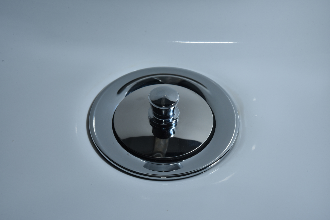
Choosing the right bathtub drain stopper is essential for creating a comfortable and functional bathing experience. With over 20 common
Request your free material sample below. By submitting, you agree to receive occasional product updates and offers from Badeloft. Unsubscribe anytime.
"*" indicates required fields