Bathroom Storage Trends 2026: The Planning Guide That Changes When You Choose a Freestanding Tub
Bathroom storage fails the same way every time: it gets planned last. By the time the tiles are in and
Choosing a bathtub color is one of the few bathroom decisions you’ll live with for 15 to 20 years. Get it right and every morning starts from a place that actually feels like yours. Get it wrong and it becomes a costly reminder that follows you through every renovation plan.
Badeloft has spent over a decade manufacturing stone resin bathtubs specified by interior designers and homeowners across North America and Europe. That context, including which colors get ordered, which get returned, and which appear in every project brief across 24 consecutive months, informs every recommendation in this piece.
The NKBA 2025 Design Trends Report tracks specification patterns across thousands of residential bath projects annually. Its data on color direction, hardware preferences, and design philosophy shifts forms the backbone of the trend analysis here.
Whether you’re choosing a bathtub for a primary bath renovation or selecting the centerpiece tub for a new build, this guide covers both the 2026 color palette and the practical details that determine whether your choice holds up for a decade: material, finish, hardware, room size, and resale intent.
If you’re choosing a freestanding tub for the first time and every article seems to list a different set of trending colors, this is the place to start. Maybe you’ve been eyeing a colored bathtub for years but kept defaulting to white because you weren’t sure the trend would hold. Or you’re renovating with resale in mind and want to know, honestly, whether a non-white bathtub works in your favor or against you.
By the end of this piece, you’ll have a clear view of what’s genuinely leading in 2026 and, just as importantly, what’s peaking out. The longer outcome is simpler: you pick a color you won’t second-guess in five years.
We’ll cover why the color decision has changed fundamentally in 2026, the five colors worth serious consideration, what’s going out of style, how your bathtub’s material affects the way color reads in real light, and how to match your choice to your bathroom’s size, hardware, and long-term value.
So let’s start with why the color rules shifted in 2026, and why some of the advice from 2024 may now be pointing you in the wrong direction.
For most of the past decade, the bathtub was spec’d last. You chose the tile, picked the vanity, painted the walls, and then matched the tub to whatever was left. That process made white the default answer, not a deliberate choice.
In 2026, that workflow has reversed. Designers now treat the bathtub as the palette anchor of the primary bathroom: the first color decision, with tile, vanity, and hardware chosen to harmonize around it. The NKBA 2025 Design Trends Report documents this shift, and it’s visible in how manufacturers’ color offerings are expanding while standard acrylic white stagnates.
The implications are significant. The bathtub color you choose is no longer decorative. It’s structural. It sets the palette for the room. Choosing a color that’s loud, oversaturated, or trending-but-fragile now costs more than it used to, because the tub has to do more work. A color that photographs well on a trend blog but reads wrong in your bathroom’s light, against your tile, under your fixtures, is a harder problem to solve when the tub is the design anchor rather than the afterthought.
This is also why the 2026 palette has moved away from statement colors and toward quieter, more adaptive hues. The colors leading right now are the ones that anchor well: versatile enough to harmonize with multiple directions, specific enough to feel intentional.
The 2026 palette is defined by a single quality: desaturation. The colors gaining serious traction are quieter versions of what was trending in 2023 and 2024, with less pigment, more restraint, and more staying power. Here are the five worth serious consideration.
This is not standard white. The distinction matters more than most buyers realize. Oat has a slight cream or warm gray undertone that performs entirely differently under natural light: it reads soft and organic rather than bright and clinical. In matte stone resin, warm off-white is the most specified non-white bathtub color across mid-to-high-end primary bath projects in 2026.
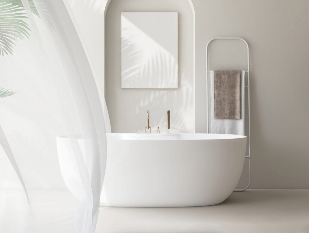
It works because it’s almost universally compatible. It pairs naturally with warm wood vanities, with cool-gray tile, with unlacquered brass or matte black hardware. It reads as designed without committing to a direction that could age. If you’re buying a bathtub for a bathroom you’re keeping for 10 or more years and you want one choice you’re unlikely to regret, oat or warm off-white is the most defensible option on the current palette.
Styling direction: Unlacquered brass or aged bronze fixtures. Warm white or linen towels. Muted tile, honed marble, or large-format stone-look porcelain in a warm or neutral tone.
The sage green leading in 2026 is not the shade from the trend coverage of two years ago. It’s quieter: closer to a gray-green in many finishes, reading almost like a neutral in certain lighting conditions rather than a clear color statement. The saturated, bright version of sage has peaked. This one has more longevity.
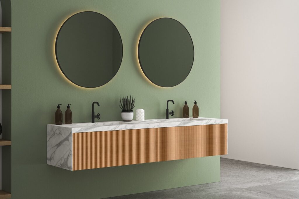
It performs well in bathrooms with strong natural light, where it shifts warmly through the day. In north-facing bathrooms with cooler, indirect light, it can read slightly cold. Material finish matters here more than with warmer colors: stone resin diffuses color more gently than acrylic, so sage green in stone resin tends to read warmer and more organic than the same color in a gloss acrylic finish.
Styling direction: Aged bronze or unlacquered brass for warmth. Cream or warm linen textiles. Avoid polished chrome, which creates a clinical contrast against botanical tones.
Terracotta peaked in trend coverage in 2024, but the specification data shows it still growing in 2026. The version earning the most project work now is softer and more muted: a dusty, sun-bleached clay rather than the orange-forward version that dominated earlier trend cycles. If you remember terracotta from the 1980s, the 2026 version reads nothing like that. It’s quieter, more sophisticated, and considerably easier to live with.
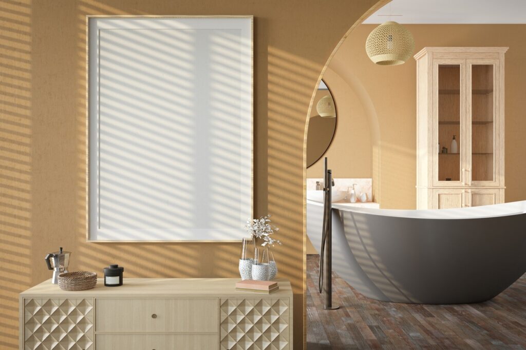
It works best in bathrooms where the overall direction is nature-inspired: natural stone, wood, soft linen. It’s a strong choice if you want warmth and character without the risk of a bold statement color. In small bathrooms, use terracotta with care. A muted oat tub with terracotta introduced through tile and textiles will read better than a terracotta bathtub in a tight space.
Styling direction: Warm brass or matte black fixtures. Natural stone or wood-look tile. Woven baskets, ceramic accessories, warm-toned linens.
Matte charcoal in stone resin is one of the fastest-growing color categories in 2026 premium bath specification. It’s dramatic without being aggressive. In stone resin specifically, the matte surface absorbs light rather than reflecting it, creating depth rather than stark contrast. This is not the same effect you get from a high-gloss black acrylic tub, which can read harder and more manufactured.
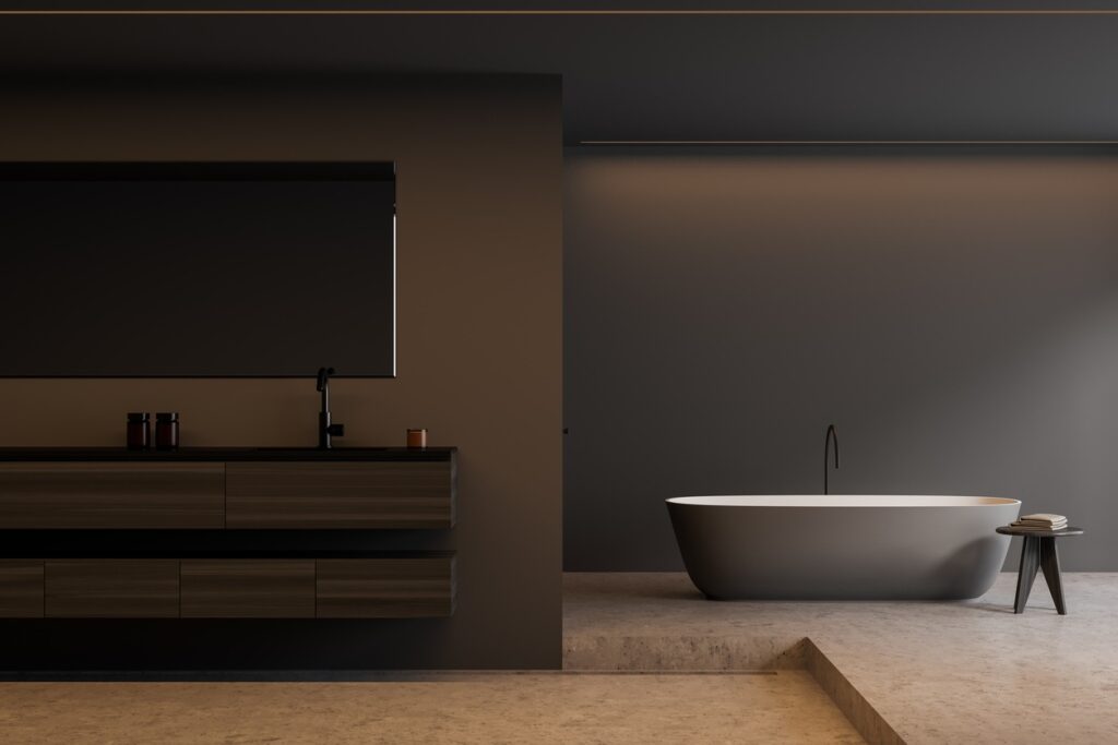
This color requires a commitment from the room. It works best in bathrooms with generous natural light and a deliberately spare, light palette everywhere else. In a small, north-facing bathroom with minimal windows, charcoal will feel heavy. Know your room before choosing this one. But in the right space, it’s the strongest design statement on the 2026 palette.
Styling direction: Unlacquered brass for warmth against the dark body; matte black for a monolithic, graphic effect. Crisp white or warm linen towels. Large-format tile in light stone or warm white.
Stone gray occupies the space between warm off-white and charcoal: sophisticated without drama, compatible with almost any design direction. In 2026, the version with a warm undertone, a gray-beige rather than a gray-blue, outperforms cooler variants. Cool gray in a bathtub can read clinical; warm gray reads grounded.
This is the choice for homeowners and designers who want a non-white tub without committing to color. It adds quiet sophistication while remaining compatible with almost any tile, fixture, or hardware choice. It also happens to be one of the strongest colors for resale: neutral enough to read as an upgrade, specific enough to feel intentional.
Styling direction: Brushed nickel, unlacquered brass, or matte black all pair cleanly. Neutral textiles in warm white, cream, or linen. Wide latitude on tile direction.
Some colors that appeared prominently in trend coverage 12 to 18 months ago have peaked. If you’re choosing a bathtub now and planning to keep it for a decade, these are worth approaching carefully.
Cobalt blue: A strong statement color that made sense when maximalism was ascendant. In 2026, the primary bath direction is overwhelmingly toward grounded, desaturated palettes. Cobalt reads loud against the current aesthetic, and it’s one of the harder bathtub colors to overcome at resale.
Mustard yellow: The bold, energetic personality color of 2022 through 2024 is out of step with the wellness-and-retreat direction now driving primary bath design. Where the market has moved toward calm and restorative, mustard yellow remains cheerful and activating. Those aren’t bad qualities. They’re just the wrong note for a space designed around relaxation.
Glossy gold bathtub bodies: Gold as a fixture accent remains strong in 2026, particularly in the form of unlacquered brass and aged bronze. Gold as the color of the bathtub itself reads as a specific mid-2020s moment. The bathtub body and the fixture finish are different decisions. The finish is still very much current; the body color is not.
High-saturation blush pink: The candy-bright blush that drove social media engagement for the past three years is aging quickly. Desaturated, dusty versions of pink remain in the conversation, especially in stone resin where they read more muted and organic. But the saturated, high-pigment version is peaking out.
Standard high-gloss white on freestanding tubs: This isn’t going away entirely, but high-gloss white on a freestanding centerpiece tub is losing ground to matte finishes, warm off-white, and stone-inspired textures. If you’re buying a freestanding tub as the design focal point of a primary bath, the high-gloss finish now positions it as a decade-old choice rather than a current one.
This is the detail most trend articles skip, and it’s one of the most consequential things to understand before you buy. Color in a bathtub is not just a surface quality. It’s a function of how the material interacts with light.
Stone resin: Matte and satin stone resin finishes absorb and diffuse light softly. Color in stone resin reads warmer, more organic, and more nuanced than in synthetic materials. The same sage green in stone resin versus acrylic will read differently: in stone resin, the color feels like a material quality rather than a coat of paint applied over a substrate. This is a significant part of why stone resin dominates premium bath specification in 2026. The finish is less artificial, and color holds more character over time rather than looking painted-on.
Acrylic: Acrylic in gloss finishes reflects light rather than diffusing it. Colors can read cooler and more synthetic. A color that reads warm and grounded in a stone resin sample may read harder or more plastic in a gloss acrylic tub. Acrylic is not the wrong choice, but it does mean you need to see the actual material sample in the color you’re considering, not just a color chip or a photograph.
Cast iron with enamel: Enamel on cast iron has a depth and richness that synthetic materials struggle to replicate. Colors in enamel have their own light behavior: richer, more luminous, with a quality that feels less manufactured. The practical challenges are a more limited color range and significantly greater installation complexity due to weight.
The practical implication for all three: always request a material sample in the specific color before committing. A color that looks right in a showroom photograph may look entirely different in your specific material, under your bathroom’s specific light.
The hardware landscape in 2026 has narrowed more sharply than the color palette, and the shift is worth understanding before you lock in your bathtub color.
Polished chrome has dropped out of primary bath specification at the mid-to-high end. The change happened gradually from 2023, but by late 2024 it had largely completed. Chrome still works in secondary bathrooms and in traditional or transitional contexts. As the pairing for a freestanding statement tub, it now reads as a dated signal rather than a neutral default.
Unlacquered brass is the leading hardware choice of 2026. It develops a natural patina over time, warming as it ages, and it pairs with every color on the leading 2026 palette. The important word is unlacquered: a living finish that changes is the point. Lacquered brass, which stays uniformly gold, reads differently and is not the same trend.
Aged bronze and oil-rubbed bronze are the second-strongest hardware directions, particularly for earth-tone and terracotta palettes. Slightly more rustic than unlacquered brass but with the same warmth.
Matte black remains strong, especially paired with charcoal and near-black tubs and in bathrooms with a contemporary or graphic direction. It pairs less naturally with warm earth tones, where it can create too much contrast.
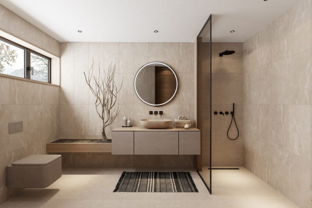
Brushed nickel holds a useful middle ground: warmer than chrome, more neutral than brass. It works particularly well with stone gray and warm off-white tubs and is a strong choice for anyone uncertain between the brass and black directions.
The design logic for small bathrooms is straightforward: lighter, warmer-reading finishes expand perceived space, while saturated or very dark colors compress it. The application is more specific than the rule.
In a bathroom under 60 square feet, oat, warm off-white, or muted stone gray in a matte finish can make the tub feel integrated with the space rather than dominant within it. The matte surface of stone resin is particularly useful here. It doesn’t bounce light the way a gloss finish does, so it doesn’t create harsh reflections in a tight space. The tub becomes part of the room rather than the thing you’re constantly working around visually.
If you want color in a small bathroom, the approach that works most reliably is to keep the tub light and introduce color through tile, paint, and textiles. A sage green accent wall or terracotta tile detail reads as intentional and expansive. A dark terracotta bathtub in a 50-square-foot bathroom reads as heavy and difficult to escape.
There is one exception worth naming: a small bathroom deliberately designed around a moody, immersive palette, where the smallness is part of the intention and the whole room commits to the direction, can absorb a charcoal or near-black tub. But that requires everything in the room to align with the choice. It doesn’t work if the tub is the only dark element in an otherwise light and neutral bathroom.
Yes, and the gap between strong-performing and weak-performing color choices at resale is wider than most homeowners expect.
Neutral, desaturated finishes, specifically warm off-white, stone gray, and muted sage, perform well at resale because they let buyers project their own preferences onto the space. The bathroom reads as designed and intentional without demanding that the next owner share the current owner’s taste. A well-chosen neutral bathtub reads as an upgrade. A polarizing statement color reads as an obstacle.
Bold colors are the hardest to overcome. Cobalt blue, bright gold, high-saturation blush, and mustard yellow are among the most commonly cited reasons buyers request renovation credits or simply pass on an otherwise strong listing. The math is simple: when a buyer encounters a color they don’t love on a fixture that costs $8,000–$15,000 to replace, it becomes a line item in the negotiation, not a design choice they can live with.
The practical guidance comes down to timeline. If you’re staying for 5 years or fewer, keep the bathtub in the upper range of the neutral palette: oat, warm off-white, stone gray, muted sage. If you’re keeping the bathroom for 15 or more years, choose what you love. Time dissolves the resale calculus. If you’re in the 7–12 year middle range, the colors that have held up consistently across multiple design cycles, oat, terracotta in its muted form, and stone gray, are your safest calls.
With the full picture in front of you, the decision becomes more straightforward. These four questions determine the right color for your specific bathroom.
1. What is your bathroom’s light quality?
North-facing rooms with cool, indirect light favor warm undertones: oat, warm off-white, clay. South- and west-facing rooms with strong direct light can carry cooler tones like stone gray or muted sage. Charcoal and near-black require generous natural light or a deliberate artificial lighting scheme at 2,700K color temperature or warmer. In cool-light bathrooms, dark colors can read oppressive rather than dramatic.
2. What is your timeline?
Selling within 7 years: stay in the neutral range. Keeping for 15 or more years: choose for what you love to live with. Staying for 7–12 years: oat, sage, terracotta in its muted form, and stone gray all hold their ground across that span.
3. What is your bathroom’s size?
Under 60 square feet: lighter tones, matte finish, keep the tub from visually dominating. Over 80 square feet: the full palette is available, and charcoal and terracotta in particular benefit from room to breathe. For bathrooms between those sizes, the answer depends on ceiling height, window placement, and how much of the floor and wall you can see at once.
4. What material are you buying?
If you’re buying in stone resin, see the material sample in the specific color in your bathroom’s light before deciding. Stone resin reads warmer and more nuanced than acrylic in most colors. The sample is the only reliable test. A color you’re certain about from a photograph may look entirely different in the actual material.
The most common bathtub color regret comes from the same place as most major design regrets: choosing based on what looked right in a photograph rather than what the material and color will actually look and feel like in a specific room, under specific light, every single day for the next decade or two.
The 2026 palette simplifies that decision considerably. The colors leading right now, oat, muted sage, terracotta in its quieter form, charcoal, stone gray, are not aggressive or difficult to live with. They’re grounded, intentional, and built to hold up. They work as palette anchors. They work at resale. They work in tight spaces and generous ones.
Choose the bathtub first. Let everything else follow from there.

Eric is the founder and president of Badeloft USA. He has been the president of Badeloft’s US division for over ten years and oversees all marketing and branding aspects of Badeloftusa.com.
His expertise lies in small business development, sales, and home and bathroom industry trends and information.
Contact us with any business related inquiries.
Badeloft is dedicated to helping homeowners make informed decisions about their bathrooms. We adhere to strict editorial guidelines to ensure our content is accurate, trustworthy, and useful.
Request free stone resin and stainless steel material samples. Delivered to your door.
Bathroom storage fails the same way every time: it gets planned last. By the time the tiles are in and
A waterfall faucet is one of the most visually compelling fixtures a bathroom can have. It’s also one of the
Choosing a bathtub color is one of the few bathroom decisions you’ll live with for 15 to 20 years. Get
Most bathtub decisions come down to what fits the space and what fits the budget. That is a reasonable starting
Request your free material sample below. By submitting, you agree to receive occasional product updates and offers from Badeloft. Unsubscribe anytime.
"*" indicates required fields